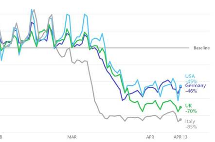
Apple has released a set of “Mobility Trends Reports” – a trove of anonymised and aggregated data that describes how people have moved around the world in the three months from 13 January to 13 April.
The data measures walking, driving and public transport use. And as you’d expect and as depicted in the image atop this story, human movement dropped off markedly as national coronavirus lockdowns came into effect.
Apple has explained the source of the data as follows:
This data is generated by counting the number of requests made to Apple Maps for directions in select countries/regions and cities. Data that is sent from users’ devices to the Maps service is associated with random, rotating identifiers so Apple doesn’t have a profile of your movements and searches. Data availability in a particular country/region or city is subject to a number of factors, including minimum thresholds for direction requests made per day.
Apple justified the release by saying it thinks it’ll help governments understand what its citizens are up to in these viral times. The company has also said this is a limited offer – it won’t be sharing this kind of analysis once the crisis passes.
But the data is also a peek at what Apple is capable of. And presumably also what Google, Microsoft, Waze, Mapquest and other spatial services providers can do too. Let’s not even imagine what Facebook could produce. ®

Robin Edgar
Organisational Structures | Technology and Science | Military, IT and Lifestyle consultancy | Social, Broadcast & Cross Media | Flying aircraft

