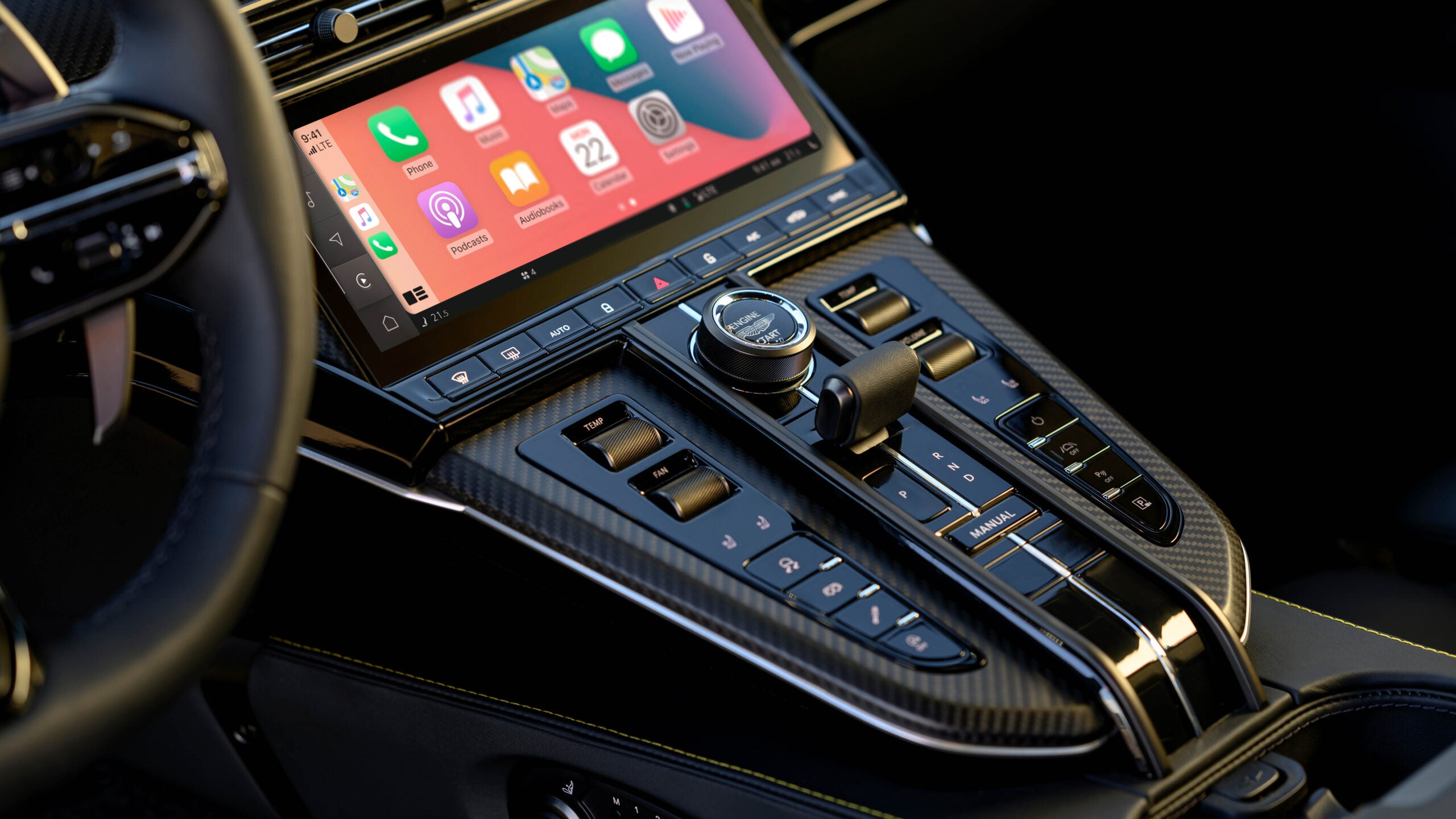
To decide how to best implement their cars’ touchscreens, Aston designers went out and sampled a range of vehicles, using their controls and noting the steps necessary to activate certain functions. Any feature expected to be immediately available that wasn’t triggered the “piss-off factor.”
The new Vantage is a good example of Aston’s design philosophy. It has a touchscreen, but it’s accompanied by many physical buttons, switches, and knobs. Nurnberger told CarExpert that Aston considered moving the seat controls into the touchscreen, but owners said they like to adjust their seat on the move depending on how they’re driving, and touchscreen-based settings are cumbersome and unsafe to use on the fly. The same thinking applies to volume and HVAC-related inputs.
“That’s the thing about the piss-off factor. When you want it, you want it instantly,” said Nurnberger. “If you want to turn the volume up and down, temperature absolutely—the minute you’ve got to go into a screen and tap for temperature, you’ve lost the customer. You’ve lost the experience.”
Aston is echoing what so many of us have already been saying. I think we can all agree that more button-heavy interiors are preferred. Touchscreens require more mental effort to use while simultaneously offering zero tactile feedback—frustrating at best and downright dangerous at worst. The automaker’s approach is a simple and sensible one that the entire industry should follow, especially brands that sell cars most of us can actually afford: if it pisses people off, don’t do it.
Source: Aston Martin Created a Metric for Touchscreen-Induced Anger

Robin Edgar
Organisational Structures | Technology and Science | Military, IT and Lifestyle consultancy | Social, Broadcast & Cross Media | Flying aircraft

