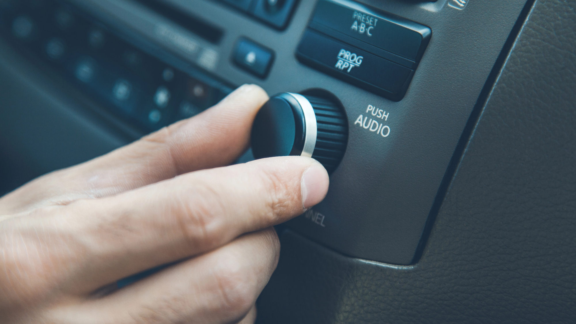
For years, car safety experts and everyday drivers have bemoaned the loss of the humble button. Modern cars have almost unilaterally replaced dashboards full of tactile knobs with sleek, iPad-like digital displays, despite concerns these alluring devices might be making distracted driving worse. But there are signs the tide might be shifting.
After going all in on touch screens for years, Korean carmaker Hyundai is publicly shifting gears. Hyundai Design North America Vice President Ha Hak-soo remarked on the shift during a recent interview with JoongAng Daily admitting the company was lured in by the “wow” factor of massive, all-in-one screen-based infotainment systems. Customers apparently didn’t share that enthusiasm.
“When we tested with our focus group, we realized that people get stressed, annoyed and steamed when they want to control something in a pinch but are unable to do so,” Ha said.
Now the company is reversing course. Hyundai previously announced it would use physical buttons and knobs for many in-cabin controls across its new lineup of vehicles. They aren’t alone. Porsche and Volkswagen are amongst the major brands planning to buck the trend. It’s part of what looks like a broader acknowledgment of so-called “screen fatigue” setting in amongst car buyers.
[…]
it turns out drivers, for the most part, aren’t too interested in all that choice and functionality. A survey of U.S. car owners by JD Power last year found a consecutive two-year decline in overall consumer satisfaction with their vehicles for the first time in 28 years. The main driver of that dissatisfaction was complicated, difficult to navigate touch-based infotainment systems. A more recent JD Power survey found that most drivers ranked passenger-side display screens–a growing trend in the industry–as simply “not necessary.” Only 56% of drivers surveyed said they preferred to use their vehicle’s built-in infotainment systems to play audio.
“This year’s study makes it clear that owners find some technologies of little use and/or are continually annoying,” JD Power director of user experience benchmarking and technology Kathleen Rizk, said in a statement.
There’s also evidence a growing reliance on overly complicated touch based infotainment displays may be a safety hazard. A 2017 study conducted by the AAA Foundation claims drivers navigating through in-car screens to program navigation apps and other features were “visually and mentally” distracted for an average of 40 seconds. A car traveling at 50mph could cover half a mile during that time. Buttons and knobs aren’t totally distraction-free, but research shows their tactile response allows drivers to use them more easily without looking down and away from the road. The European New Car Assessment Program (NCAP), an independent safety organization, stepped into the debate earlier this year and announced it would grant five-star safety ratings to cars with physical controls for turn signals, windshield wipers, horns, and other critical features.
[…]
Source: Goodbye, annoying touchscreens. Welcome back, buttons? | Popular Science

Robin Edgar
Organisational Structures | Technology and Science | Military, IT and Lifestyle consultancy | Social, Broadcast & Cross Media | Flying aircraft
